"It’s the urge to change the standard
That drives creativity further.
So a portfolio shouldn’t show the standard.
It should challenge and provoke it."
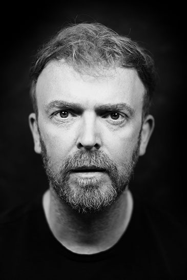
photo by Bas de Graaf
THIS IS JORIS VAN ELK.COM


Joris van Elk on portfolios

Why?
From 2000 till 2005, Joris taught at the academy, guiding young talent to compose stunning portfolios. His experience in teaching also gave him the opportunity to guide the next generation of creatives at FHV BBDO during exciting evening sessions and be part of the examination board at the well-known Willem de Kooning academy in Rotterdam.
As one of the initiators of the One Club’s Portfolio Night in Amsterdam, he has seen the evolution of portfolios during the past 25 years.
You must have seen hundreds of portfolios by now. What’s the difference between a good and a bad portfolio?
First of all, there is no such thing as a bad portfolio. Every individual who has put effort and time into making a portfolio and has the guts to show it to someone else has done something good. It might not be your kind of stuff, it might not be filled with brilliant ideas, but there’s always something good in every portfolio. Still, there is a difference between a good portfolio and a brilliant portfolio.
The ones that get noticed are the ones composed like a beautiful full course dinner. It starts off with a surprising appetizer. A smart idea that opens the eyes of the viewer and makes you hungry for the next idea. Then you will be confronted with some relevés some nice light-hearted campaigns or ideas that show the different skills of the creative. Then the main course is served: well thought-out and executed 360 campaigns that dazzle the mind. The stuff that makes you jealous and grind your teeth. Then the cheese selection will be presented: either some charity stuff or some free work that show the core of what makes this creative tick. The meal is finished with a delicious desert: an idea so sweet you will taste it waking up in the middle of the night.
Are there certain things one should not put in their portfolio?
Don’t put in any idea that is middle of the road. It can be outrageous in execution, strategy, or design, as long as it isn’t your average advertising stuff. Don’t get me wrong. Everybody working in advertising will have to do their chunk of ad stuff, probably more than you ask for, but it isn’t the stuff you want to put in your portfolio.
But isn’t the middle-of-the-road advertising the stuff that needs to be shown as it is probably the most work
you have to do?
You’re absolutely right, but you have to show character. If you last in advertising more than a few years, every creative director knows you will be able to deliver a B+. But the minute you start a career in advertising, you’ve sold your soul to progress. It’s the urge to change the standard that drives creativity further. So a portfolio shouldn’t show the standard. It should challenge and provoke it.
You’ve decided to get rid of your own portfolio on this site. How come?
Everybody starting in advertising needs a good portfolio. And every creative making a career needs a portfolio to climb the ladder, but at a certain point in your career a portfolio becomes a catalog of an ancient museum. At that moment you should make a decision. Skip the portfolio and continue making new work to challenge your past, or collect all your work, expose it, and hope it will get you into the Hall of Fame. I prefer to do the first.
E: mail@jorisvanelk.com M: +31 (0)6 21 54 82 46
© 2022 jorisvanelk.com